The decision which news are "front-page news" is driven by two factors: Time and importance.
Classical newspapers employ staff to make the decision which news have the right mix of freshness and importance.
Social news sites like Reddit and Hacker News let the readers vote on what is popular. They then put time and popularity into a formula which decides what gets on the front-page. Reddit uses this formula to rank news: log10(p)-t/45000. Where p is popularity in upvotes and t is time in seconds. Hacker News uses its own, more complex formula, which is only partly known.
Let's call these two approaches curation and formula.
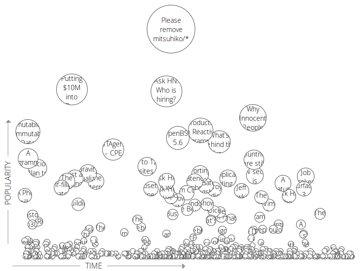
By putting news on a two-dimensional chart, where one axis represents time and the other popularity, maybe it is possible to do away with both, curation and formula. And let the readers decide how they navigate through the news.
To test this, I built a tool for it into the gnod social web workbench. The result looks like this:
I have been reading Hacker News this way for the last 7 days and it works quite well. During this week, I added a bunch of tools to make it more convenient:
- Hover or tap shows story details
- Read stories turn blue
- You can set a threshold for minimum popularity
- Search for a phrase
- Limit to a user
- Mark interesting stories
Moving the point threshold in the above example up to 50, we get less fresh news and more popular news:
Try moving the point threshold up to a 1000 and you will see a history of Hacker News right from the beginning, showing the most popular stories of all time.
By filtering for a phrase, you can visualize the history of a topic or project. Here is DuckDuckGo for example:
Well, try it yourself. I think (hope) it's pretty self explanatory.
I will add more news sources over the coming weeks. If you have feature requests, please put them in the discussion section below.


